Wednesday, August 6, 2014

The Love of a Little Girl

Well then, exactly one month after we move out to embark on our remodel we found out we were pregnant again. Thankfully we embarked on this major reno or else baby girl would have been sleeping in a closet!

I had to scrap my playroom ideas and shift gears towards a baby girl's room.  I have never been one for pink and the boys room has me deep into rustic, muted, natural materials.  I was actually stumped on what to do, I wanted to keep it in line with our esthetic but wanted to give her room to have a feminine touch she could grow into.

We already have the crib, a daybed and rocker (which needed to be reupholstered).  I also planned to swipe the black dresser that used to be in the dining room.  That left paint color and accessories.

First the Paint...

I loved this room from House*Tweaking for her own #3 baby girl.  The color is BM Dark Pewter - a dark grey with hint of green to it.


Before the remodel, our tiny third bedroom was painted a dark grey and I loved it, but this room will be bigger and I am nervous about a color like that being too dark in a wider space, so I am going to try a two tone look and bring in a chair rail to separate.  The top color will be BM French Canvas, which we have in our basement hallway and it a smooth, creamy off white; the bottom, BM Dark Pewter.  I am still working through the chair rail color.


Now the accessories...

Well with most of the furniture already picked out and my interest in the paint scheme, it was down to the inspiration for accessories and accent color.  I need to get the chair reupholstered and my mind was running into 50 different directions for possibilities.

I started with curtains to inspire the vibe of the room.  Wanting fun, well made curtains with a feminine feel, I turned to Anthropologie and fell in love with these.

I loved the femininity of the birds and the array of colors it allowed me to bring into the room. They are pricey but since I had all of the furniture already, I felt it ok to splurge a little on #3.


This also allowed me to a lot of options for the rocker fabric.  I wanted find something graphic that complemented the curtains. Spoonflower to the rescue - I can't get enough of this site. You can get any fabric (or paper) in hundreds of different patterns. Don't like what you see? Design you own. Brilliant. 

I ordered a few samples that didn't quite fit the bill. I liked the bold color as the background but the teal wasn't right. I ended up ordering deep coral ogee without seeing the sample and thankfully it worked.


I am really happy with how this room is coming together and I hope she is too!

Sunday, March 17, 2013

The Love of a Little Boy

Oh my, it has been a year since my last post.  I took on a new job and neglected my blog.  Now that we are DEEP into a renovation, I owe it to myself to get this thing going again.  After all, I started it to keep a diary of a fixer-upper in case we decided to do it again so I could accurately recall the good, bad and ugly.

So I am starting fresh and decided to throw chronological order to the wind (you might see a post of an activity I did in 2011 shortly after we moved in, followed by a reno brainstorm from 2013).  I am giving myself the right to post on what is moving me today and maybe it won't be a year before I post again.

So today, it's all about the boys room.

We have two boys that we plan to have share a room even when we will have two viable rooms.  Before the renovation, we had one decent sized room and one tiny, not fit to be a room (no windows).  Eventually we moved them in together and turned the tiny room into a playroom.  Once you have a playroom, there is no going back.  Throw in the toys and close the door.  Amen!

Alas, there is the debate with a 5 and 2 year old on the decor.  I am working to find the balance of my style with a room they will feel is there own.   If left to them, it would be orange and red walls and Star Wars everywhere.   My tastes are slightly more subdued.

My go to style is rustic, with a hint of mid century modern.  Wood, natural fabrics, muted colors.  I love a masculine feel for the boys - a bit of industrial meets camping.  I want something functional (storage a plenty, playfulness of chalkboard walls, easily accesible books and warm blankets).

The current inspirations:

Natural colors and materials. Image via Remodelista

Love this drawing table. Image via Houzz

Built in wood desk, chalk board paint. Image via Remodelista

Brilliant bookshelves. Image via Houzz

Crazy for maps, we have three SF vintage ones we plan to use.  Image via Houzz

Smart built in desk.  Image via Remodelista

Here are some items I am considering...

Wool blankets via Coyuchi

Crate&Barrel bed

Vintage locker bench via Home Decorators Collection

And don't worry,  I have already committed to the star wars night light.  It doesn't match my theme but after all,  a mom always gives in to her little boys a little!

Pottery Barn Kids Night Light


Thursday, March 1, 2012

the Crafty Sister: DIY Headboard


I have my moments of DIY but must admit that since the kiddos, my personal DIY's are usually driven by some sort of necessity rather than true creative inspiration.  Lately, I have been living DIY vicariously through my kid sister who always seems to have some project in the works.  This month she took on a chesterfield headboard.  Check it out for the how to and the finished result.  And stay tuned for more from "the Crafty Sister".


 1) Supplies needed for a Queen-Sized Headboard [under $110]:  
  • Fabric – Upholstery fabric is 54” wide, while others are 45” wide, so be conscious of your desired height dimensions. With a 60” wide desired headboard, I chose a piece that was 68” long, approximately 2 yards of fabric [Fabric Corner - $17]Sturdy Plywood (60”w x 33”h) – wide enough to cover the width of a queen bed and high enough to touch the top of box spring with enough height to sit-up comfortably. [Home Depot - $30, cut to desired size] Note: An alternative to use could be pegboard, a lighter-weight material that would not require you to drill holes into the plywood for the chesterfield effect.
  • Twin-sized Egg Crate – perfect height for my dimensions and I only had to cut a few inches off the width. It was an economical way to have foam without purchasing what can be pricey upholstery foam from Joanne’s, etc. [Bed, Bath & Beyond - $10, with a coupon]
  • Full-Sized Quilt Batting – It folded in-half and I had enough to pull over the foam and the plywood. [ACMoore - $6, with a coupon]
  • Dritz 7/8” Half Cover Buttons – These ensured the same fabric I was using for the headboard would be the same fabric for the buttons. [Windsor Button - $20]
  • Hangman – Can mount up to 200lbs [Home Depot - $15]
  • Upholstery Thread & Long 4” Needle [Fabric Corner - $7]
  • Drill/Drill Bit
  • Staple Gun/Staples
  • Measuring Tape
  • Permanent Marker
  • Scissors
  • Spray Adhesive 
 
2) Measuring/Marking/Drilling
With a 60”w x 33”h board, I measured alternating 5 and 4 hole rows. 6” or 12” apart vertically and 5.5” or 11” apart horizontally.

3) Marking/Cutting
I laid the foam next to the plywood with the flat side on top and marked/cut the button holes to align with drill holes. [Note: Spray adhesive can help to keep the foam from moving while marking/cutting]:
Then I laid the quilt batting over the foam and stapled along the edge of the plywood – starting in the center and working out, stapling 3 – 5” apart. 

4) Buttons
Using the extra fabric from the headboard, I made the 23 buttons using the Dritz 7/8” Half Ball Cover Button Kit. These were easy to complete, there is a pattern on the back of the kit with the size of the fabric circle you need to cut.  I just laid the top of the button on the fabric, tucked it into itself, catching on the teeth and then pop on the back side. No tools required.  Then I strung about 16” of doubled upholstery thread onto the eye of the back of the button, in a simple loop to fasten.
I did this all in advance to help speed along the process of putting the buttons through the board.

To place the buttons, I led with the eye of the needle through the back of the plywood and punctured the fabric.  Then I threaded the needle and pulled it back through the hole.  I taped the thread to hold in place until we were ready to staple them.  
To staple the thread of the button, I found it much easier with two people. One person to push the button and pull the thread in the back simultaneously, while the other person staples the thread. 

5) Final touches
Finally I pulled the fabric taut and stapled to the backside of the plywood, working in the center, stapling every 3 – 5”. The corners can be tricky, so I cut a bit of the batting and fabric to reduce the bulk, tucked it into itself and folded over the corner for a crisp corner. 

Using a French Cleat we attached one part to the wall and one part to the headboard and voila, new headboard!


Tuesday, February 14, 2012

the Joy of Cherry Blossoms

It is my favorite time of year in San Francisco when the cherry blossoms bloom, it usually happens in late winter because of some bout of warm weather.  The streets here are lined with them and it is such a beautiful site.  A long cherry blossom branch in a tall clear vase is one of my favorite flower displays.  Not being lucky enough to have a blossom on our property, I might admit to sending my husband out at dusk to "trim" the neighbors tree once or twice.  2012's version was bought and didn't have as many blooms but I still loved the simplistic look.


Nothing says SF like a bacon truck flanked by beautiful cherry blossom trees

Photo: Etsy via Jonathanly
Etsy has some great Cherry Blossom wall decals which are cute in a nursery but I came across this artwork from Jonathan Ly, love the graffiti style.


And if you are so inclined, why not celebrate cherry blossom season with your own ACME party in a box!?!

Friday, February 3, 2012

the Garden

The transformation of the backyard is one of the most significant we have made to date.  All the credit needs to go to my husband, the green thumb of the family.  He pours over organic gardening magazines and blogs the way I do over decor.  The backyard has gone through several phases in our effort to find the right balance of garden and play space.  It continues to evolve with new plantings (and our neighbors renovation) but it has been an amazing journey thus far.

Original Yard


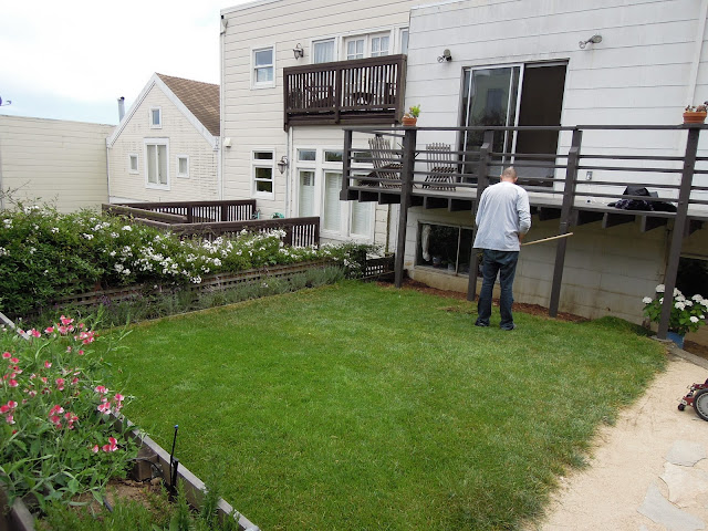
We've taken to the backyard in steps, updating as we have saved our pennies and had the time to monitor plantings.  The before picture was from the realtor site (hence the long angle lens), by the time we moved in that dirt patch was filled with a thick layer of weeds from the Autumn rain.  The path was a shoddy collection of brick with square with pink slabs in the middle.  It was a massive space but was totally inhabitable.  We pulled out the large bushes in the middle, most of the old vegetation and removed the pink slabs to create a fresh slate.  We did, however, leave the heritage roses in the back, they have been there for years and are amazing.

Phase one: new planter boxes

My husband sketched a design of the new planter boxes that he envisioned running around the backyard and dividing it in the middle with a lower box for herbs.  We used redwood but decided not to treat the wood to keep the garden as organic as possible, it has worn really well but we will have to replace it earlier then if we had used treated wood.

Phase two: Grass
 Weeds! It was a b*&%ch to get these out, the backyard was covered in it every time it rained.

 Dirt, finally ready and then....

SOD!!


I wanted a bit of a grassy patch for the kids to play on.  My bright idea now requires my husband to mow the lawn every other week....but it is sure pretty. :)


Phase three: Decomposed granite and path

Decomposed granite is rough sand, it packs down really well and becomes firm but still has movement. 

 We got the stone left over from a project that my mother-in-law did, it worked well with the gold granite.

Today

   In addition to the work we did, our neighbors are in the midst of a major renovation themselves and we benefited from them removing our old shoddy fence.

 We spend hours out here now.

 Original roses still going strong and adding some nice color to the planter boxes.

 So lucky to have a gardening husband to grow us organic veggies, yum!

 We wanted a concrete or industrial table for the outside. We found this in the workshop attached to our garage, it had shelves underneath it so I didn't initially realize it was a table.  It was just what we were looking for.  The chairs are from Costco, but I am saving up for these.


Tuesday, January 24, 2012

the Parsons Desk

I just discovered Front&Main, West Elm's blog.  As a huge fan of the store and its modern bohemian style, I am also a big fan of the blog.  They seem to always showcase their Parsons line; which is probably West Elm's most famous piece often featured in design mags and blogs.  I decided to show how I use my own Parsons desk - as an entry way console.  I decided to get the desk vs. the console because it was deeper and shorter (which worked better for the space) AND I thought it more useful to get a desk should I need to use the piece somewhere else down the line.  {SIDE NOTE: When buying a piece, I try to think of multiple uses for it therefore if it doesn't work as expected I have a back up and also helps justifying a new purchase.  My husband laughs at me for this. }